How to use a grid in web design
Discover how grids simplify web design, making it easy to create professional layouts while saving time and avoiding design headaches.

Every design starts with a blank page you stare at and wonder, “Where do I even begin?” The answer is a grid. At first glance, this approach might seem unnecessary. After all, why not just eyeball the placement and call it a day? Well, you could… but be ready to spend hours reworking the design when things don’t quite add up. To save you the headache, we’ve put together this guide to show why grids are a designer’s best friend and how to make them work.
What is a grid?
Let’s start with what a grid actually is. Simply put, it’s a system of horizontal and vertical lines that helps you structure and align elements on the page. In web design, it helps organize pages into sections using rows, columns, and margins. Instead of scattering text and visuals randomly, grids structure them in a way that’s both logical and visually pleasing.
This technique has been a go-to in design for good reason. It ensures balance and keeps layouts looking professional, no matter the platform. As a result, this tool can be used when designing a website, an app, or even a print design. This list is endless, but the fact remains the same — grids keep things consistent, clear, and a whole lot easier for the user to navigate.

The importance of grid layout design
On top of keeping your design structured, grids are super handy for responsiveness. They make it easy for layouts to adapt across devices — shrinking from multiple columns on a desktop to a few on a tablet and just one on a mobile screen. This way, your design stays clean, consistent, and easy to use, regardless of what size screen it’s on.
More so, grids save time and make decisions easier. With a clear framework, you’re not stuck second-guessing every move or constantly tweaking placements. They also simplify teamwork, giving designers, developers, and clients a shared system to follow. This way, everyone’s on the same page, and the whole process runs smoother.
What are the different types of grids?
Grids come in all shapes and sizes, each tailored to a specific design need. Some are perfect for creating clean, minimal layouts, while others handle more complex and dynamic structures. Let’s take a closer look at the main types and how they can elevate your design game.
Manuscript grid
A manuscript grid, often called a single-column grid, is one of the simplest structures. It’s perfect for designs with large blocks of text or images, like books, newspapers, or reports. Essentially, it creates a single rectangular area on the page that acts as a container, keeping everything neatly aligned and easy to read.
Modular grid
A modular grid combines columns and rows to create a flexible, organized layout. It’s widely used in newspapers, magazines, and even in web and app design. This type of grid helps maintain structure while allowing enough flexibility for a visually appealing and user-friendly design.
Column grid
A column grid divides your layout into 2–12 or more columns, making it easy to organize text, images, and other elements. Details can fit neatly into a single section or stretch across multiple ones for more emphasis. The spaces between, known as gutters, make the design look clean.
Hierarchical grid
A hierarchical grid organizes content based on its importance. Commonly used in web design, it helps draw attention to key elements and maintain a sense of order. This layout lets you start placing the most important items first, with rows, columns, or modules arranged around them to support the overall look.
Baseline grid
A baseline grid creates a consistent alignment by defining where each line of text sits. It’s essentially the spacing between lines, maintaining readability and a polished look. While commonly used in print layouts, it’s equally valuable in web design, especially for text-heavy pages, to achieve a visually appealing look.
Advanced tips for mastering grids
To create a great design, think about the grid you want to use. You could stick with one type, place elements around it, and wrap up the project smoothly. But if you’re looking to add a little extra flair, we’ve prepared the next tips that might come in handy.

Choose the right grid system for your project
To start with the right grid system, take time to analyze the project’s needs. If you’re dealing with content-rich designs, like blogs or online publications, a column grid works wonders for organizing text and images. When your focus is on visuals, like a portfolio or e-commerce site, a modular grid can give you the flexibility to showcase products or projects effectively.
In our experience with countless design projects, we’ve found that a simple yet powerful tip is to sketch your grid not on a computer but with a good old-fashioned pencil and paper. It might feel unusual at first, but this approach opens up room for creativity and helps you tailor the grid to the unique needs of the project.
Combine grid systems for unique layouts
When it comes to creativity, limits don’t exist — and grids are no exception. There are no strict rules you have to follow, so why not break a few? Sometimes, combining different grid systems can lead to surprising results that will impress you (and wow your client).
For example, use a modular grid for the main content and a baseline grid to align text perfectly. Mixing systems lets you emphasize certain elements while keeping the overall design cohesive. The key is to experiment and find a combination that enhances the project without overwhelming it.
Experiment with asymmetrical grids
Asymmetrical grids are a great way to break free from traditional layouts and add a dynamic feel to the design. By intentionally creating uneven spaces and unexpected alignments, you can draw attention to key elements and keep the viewer engaged. The trick is to maintain harmony even in the asymmetry, ensuring the layout feels intentional rather than random.
Make your grid layout responsive
Considering that most people browse on their devices, make sure your design can easily adapt to them. For this, adjust the number of columns and spacing at key breakpoints to maintain readability. By building flexibility into the grid, you’ll create a user-friendly experience that keeps the design consistent and accessible everywhere.
Of course, there are times when a project is intended solely for a desktop version of the product. In these cases, you can focus on a fixed grid layout tailored to larger screens. However, it’s always worth considering whether the project might need to expand to other platforms in the future so you’re prepared for potential updates.
Keep the balance with white space
The best way to maintain balance is by using white space, or negative space. We highly recommend not overlooking such a tiny, at first glance, but very important thing. Use it wisely — don’t be afraid to leave certain parts of your layout empty. This gives the design room to breathe and prevents it from feeling overcrowded or chaotic. Sometimes, less really is more!
Common mistakes to avoid when designing with grids
One mistake designers often make is relying too rigidly on their grid, which can stifle creativity. Grids are tools, not rules, and clinging to them too tightly can lead to layouts that feel stiff or uninspired. Don’t be afraid to step outside when needed — combine structure with a touch of flexibility to keep your designs engaging and dynamic.
Another common issue is forgetting to test your choice in real-world scenarios. A grid that looks perfect in a design tool might not work well with actual content. Always give your layout a try with real text, images, and other assets to check if everything fits as intended. This step helps you avoid awkward spacing, unexpected breaks, or elements that look out of place.
Examples of grids in action
Grids are everywhere, even if you don’t immediately notice them. They silently work behind the scenes, bringing structure and aesthetics to web designs you interact with daily. Take Medium, for instance. Its minimalist article pages are built on a manuscript grid, with single-column layouts that keep readers focused on the content without distractions.
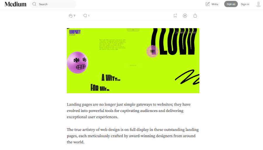 Source: Medium
On the other hand, the most popular platform, YouTube, uses a modular grid, organizing video thumbnails, descriptions, and other elements in rows and columns. This structure provides flexibility across screen sizes, keeping a consistent browsing experience on any device.
 Source: YouTube
Websites like The New York Times rely on a hierarchical grid to merge complexity with usability. Featured stories stand out with larger visuals and headlines, while supporting content is arranged in smaller sections. This way, they capture the reader’s attention and ensure a logical flow through the page.
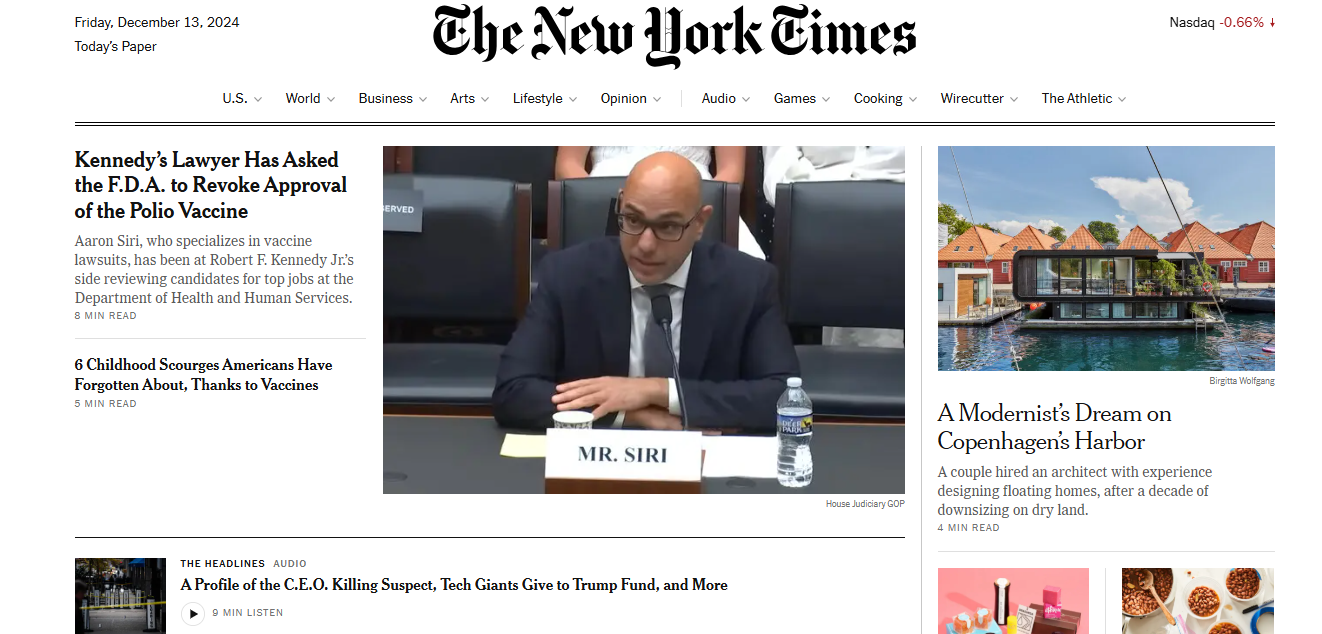 Source: The New York Times
A column grid is beautifully showcased on The Guardian, where multiple sections divide stories, ads, and multimedia content. This grid type allows for a dense presentation of information without overwhelming the reader. It’s a versatile choice for news websites that need to combine texts and visual elements.
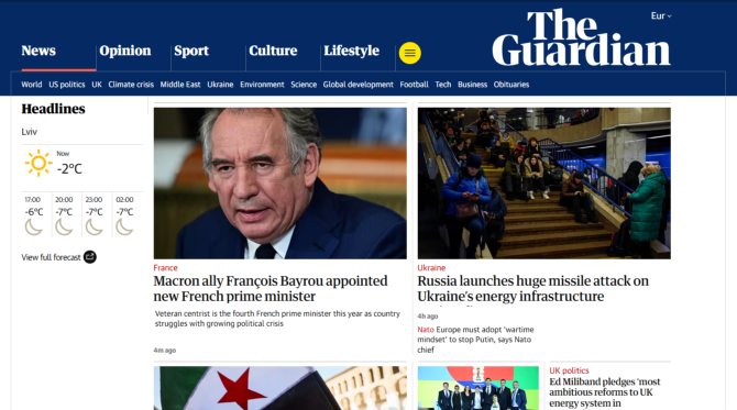 Source: The Guardian
Finally, Wikipedia uses a baseline grid to keep its design readable and organized. Every line of text aligns perfectly, creating a consistent flow for people navigating through dense content. This attention to detail makes even the most information-packed pages feel approachable and user-friendly.
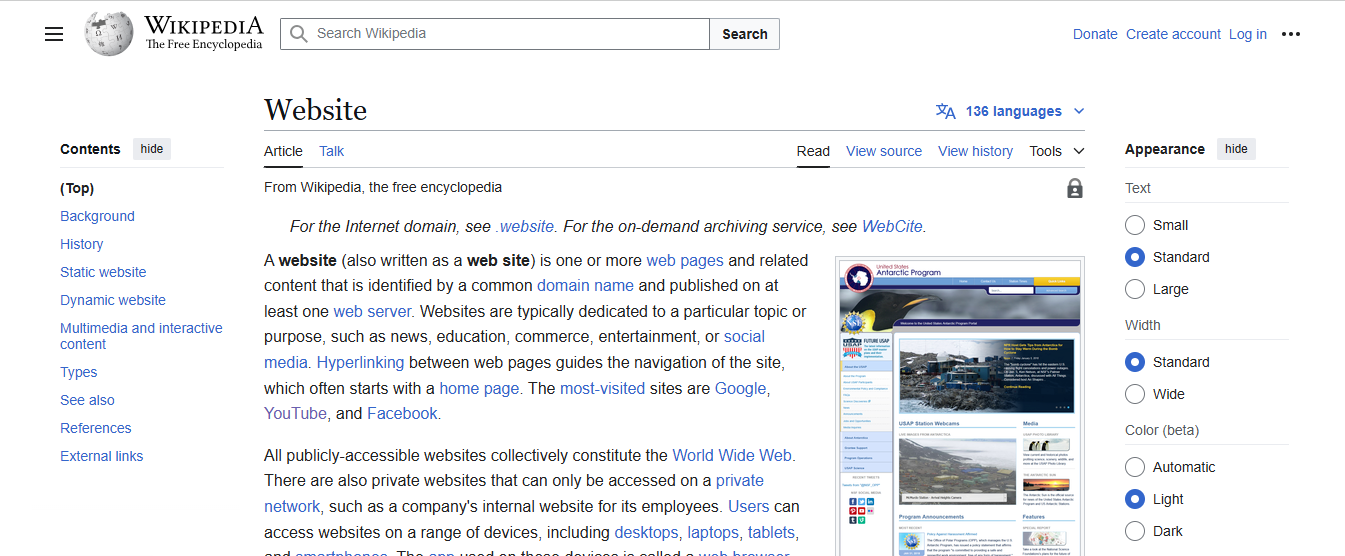 Source: Wikipedia
Put every pixel in its place
Grids might seem like a small detail, but their impact on design is undeniable. You can’t just decide to design an e-commerce site using a baseline grid — it would feel completely out of place. Instead, by choosing the right type, bending the rules a bit, and adding creativity, you can craft something truly extraordinary.
When you’re stuck for ideas, don’t hesitate to explore platforms like Dribbble, Awwwards, or Behance — they’re packed with inspiration that can spark the imagination. And if designing on your own feels overwhelming, IvorySoft is always here to help. Drop us a few lines, and let’s build the right foundation for your website.
